No results can be found
Showing results for:
-
Athletes
-
Pages
-
News
Athletes
Pages
News
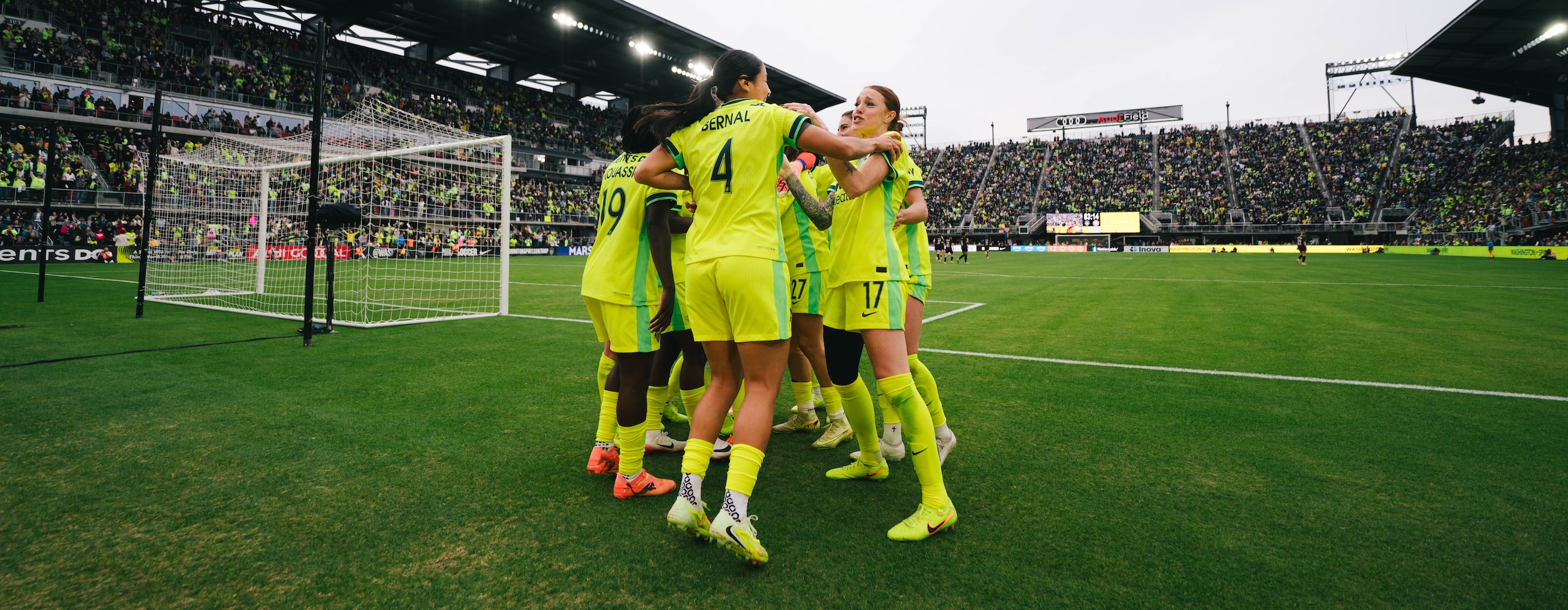
Today we launched a new logo and team color scheme as momentum builds for the the inaugural season of the professional National Women’s Soccer League on the weekend of April 13 & 14.
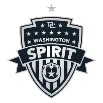
Designed in collaboration with freelancer Pete Schwadel, the new logo looks much different than the old, while retaining the symbolism originally desired by team owner Bill Lynch along with the team’s founding staff members;
“While the new logo design changed from royal blue to navy, the core elements of what the logo represents have remained the same,” team General Manager Chris Hummer explained, “We collaborated for a few weeks with a great designer who offered his help, and the result was just too good to pass up.”
What does the logo mean?
- Designed to resemble a Torch (Burning with Spirit)
- Crown holds 11 stars to represent the players on the field
- Includes Washington (metro region) and DC (the District)
- Ball with a single star to represent the 12th player (our fans), placed where the fuel for the torch would be. “Our Fans Fuel the Spirit”
- All wrapped in the Banner of Spirit for a patriotic theme honoring our flag and all of those who have given their lives and sacrificed much so we can enjoy the freedoms we have
Please comment below with your thoughts, comment on our Tumblr or Facebook pages, or hop on Twitter.
Here’s the logo:

And here’s our “social avatar”. If you look closely at the logo, you’ll see this there too. It’s the talons of an eagle grasping a soccer ball.


Drag & View 360°